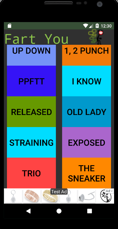
My app for Android has a refreshed GUI. You can find the app with the new Fart You GUI on the Google Play store here. In this post I’ll talk about the different layout code and what I learned. The Fart You GUI used to be made with the ConstraintLayout class. Android depreciated the Constraint Layout class. It looked like this:


The buttons didn’t scale and the whole app looked poorly written. With the new design, a LinearLayout with multiple LinearLayout and a ScrollView within, the app looks much better. The top level code within the main_activity.xml file looks like this:
<LinearLayout>
  <ScrollView>
    <LinearLayout>
    </LinearLayout>
    <LinearLayout>
    </LinearLayout>
  </ScrollView>
</LinearLayout>
The xml file did not only have LinearLayout and Scrollview. There is also <Button>, <ImageView> and <TextView> tags. This allowed me to code a top bar for the app name and image, the middle of the app with all the buttons and function of the app and a bottom bar with the Ad bar.
This produced a better result with bigger buttons that are more responsive to the screen size of the Android device. At the end the app looked like this:


If you want to see my previous posts on the Fart You app check out here and here.
Here is the documentation for LinearLayout for Android here. Thanks for reading! Fart You!
I have a new Tic Tac Toe app. You can download the game from the Google Play store here or from the Amazon app store here.
Enter your address to subscribe to this blog and receive notifications of new posts!

You must be logged in to post a comment.